Jeff Chester Art

A blog about contemporary oil painting

Alizarin Crimson

00319_alizarincrimson-l

Myths and traditions seem to keep hold in oil painting for a long time. Some of these myths, recipes and traditions have been passed down for decades and even centuries.  I believe that since artists can be tied emotionally to their materials they sometimes weigh their feelings about a material they use as more important than the empirical evidence available .  One of these common misconceptions is that Alizarin Crimson is a “must-have” colour.  Almost any how-to painting book will have it listed as one of the basic colours for a palette. Usually the reasoning is something along the lines of, “If it was good enough for the old masters it is good enough for me.”  This is the logical fallacy known as “argumentum ad antiquitatum”, or “appeal to tradition”.  Just because something has been done for a long time, does not necessarily mean that it was the right thing to do.

The big problem with Alizarin Crimson has to do with its lightfastness.  Although at one time there may not have been other options for a cool red pigment with good lightfastness there certainly are now.    The pigment PR83 is classified as Lightfastness III in oil paint (one manufacturer gives it a rating of II but that is based on their feelings about how much pigment they put in their tubes rather than actual testing).  For those unfamiliar with lightfastness, basically it is how resistant the pigment is to change when exposed to light.  Each pigment is given a rating by the American Society for Testing and Materials (ASTM). They are as follows:

ASTM I — Excellent Lightfastness (greater than 100 years without noticeable change)

ASTM II — Very Good Lightfastness (50-100 years without noticeable change)

ASTM III — Not Sufficiently Lightfast to be used in artists’ paints (15-50 years without noticeable change)

As you can see, Alizarin Crimson, at LFIII is just not durable enough from a lightfastness standpoint to be argued for rationally. Despite this almost every oil paint manufacturer still makes an Alizarin Crimson paint due to demand from customers who just “have to have it!”  For those who care about longevity though there are plenty of options to use instead of Alizarin Crimson.  Most manufacturers also make an Alizarin Crimson Hue, which is typically a blend of pigments intending to mimic the mass tone, transparency and undertone of the original.  For all intents and purposes this should satisfy your need to fill this colour gap with a much greater lightfastness.  That said there is nothing magical about the properties of Alizarin Crimson. You can certainly fill the cool red part of the colour wheel with quite a few other single pigment paints.  When I see the argument online from people who say, “But I just can’t get the same hue from other paints” it makes me think one of two things. Either this person needs more practice mixing colours, or they don’t realize that it doesn’t matter if you get the “right” colour with Alizarin Crimson if that very colour is going to fade and be different in 15 years anyways.  All that to say I don’t a good craftsman would choose Alizarin Crimson when other options are available. Here are some other lightfast options that fill a similar part of the colour wheel:

PV19: Quinacridone Red

PR122: Quinacridone Magenta

PR177 : Anthraquinone Red

PR179 : Perylene Maroon

PR264 : Pyrol Ruby


Time Lapse painting video – “Day Old”

Here is a glimpse into my working methods.  This painting took me around 90 hours all together and here you see that work condensed into about 2 minutes.  The painting is 40 x 60 inches and is oil on canvas on panel. I hope you enjoy.

Jeff

The Ethics of Art Materials

Blood in the water copy

It is impossible to live your life and not cause at least some death and destruction. This is true even if you are the most careful, loving environmentalist and animal rights champion on the planet. For instance, if you shower and use soap each day you are killing millions of bacteria. If you eat food then animals and/or plants have died to make your meal. If you’ve walked around or driven a car then you’ve inadvertently killed a plethora of insects. That is a fact. It’s not right or wrong, it is just the way it is. Most of us care about these things on a sliding scale. Killing certain things is okay, but killing others is not. Almost nobody cares about killing bacteria. Many people are okay with simply squishing a spider in their house rather than putting it outside. But as the life forms get larger and exhibit more and more human-like characteristics you will get a much more varied response as to whether or not someone thinks it is “okay” to kill something. It isn’t hard to come up a rationalization when it comes to killing animals if it is seen as a necessity. But can you make a valid argument when something dies to make your art supplies?


Many artists don’t think about their materials as possibly having negative environmental or ethical consequences. However, from the pigments and binders used to make paint to the brushes used in painting, there are issues to tackle. I will preface this discussion by first stating a fact. Every time you buy something you are telling a company that what they are doing is okay, you like it, and you want more of it. Businesses, especially big businesses are not in the business of philosophically debating morality, fair use, or what is right. They are in the business of making money. So much so that the vast majority don’t even care if their product makes you sick or kills you (think tobacco, industries dumping raw waste into rivers etc.) Yes, there are smaller businesses that make ethical choices on their own, but the vast majority of big businesses and corporations (especially when there are investors seeking returns) only care about the bottom-line. The only time they care about what people think is when those people aren’t spending money on their products.


This makes being a North American consumer difficult. It is impossible to know everything about the manufacturing methods of each and every product we buy. There really is no way to participate in our modern society and not be complicit in at least some less-than-savoury business practices, but it is something you should think about. I am not trying to be judgemental in this article. I pick and choose what I think is acceptable according to my needs just like everyone else. I am just trying to raise some issues that artists might not have considered before.


Brushes


Artists who use Kolinsky hair brushes in the United States are now being forced to think about the ethical implications of their brush choice. The importation of Kolinsky hair brushes has been temporarily stopped by the US due to improper documentation on the capture of the animals in China. The manufacture and sale of these brushes still continues in the rest of the world, but in the US you can only buy those brushes that sellers have left in stock. Once those are gone, that’s it, at least until China can prove that the Kolinsky is no longer endangered.


Kolinsky brushes are made from the hair of a weasel native to northern Asia and Russia. As far as price and reputation go they are the tip-of-the-top when it comes to brushes for both oil painting and watercolour. Their colour carrying capacity and natural spring have made them very popular. I have a couple and have to say they work very well. When I bought them I ignorantly assumed that they must just farm the animals and shave their fur off each year like sheep, thereby harvesting a renewable resource. This is not the case however. Kolinskies do not do well in captivity and so the wild animals are trapped and killed for their fur. According to the brush makers I have contacted, the animals are not killed specifically for making brushes. Instead, they are used in the fur industry and the tails are actually throw-away bits the brush makers use. So I suppose if you are okay with fur-for-fashion then there isn’t a problem. However, if you believe that killing an animal unnecessarily (as in you don’t need to wear fur or use kolinsky brushes since there are other options) is wrong then you’ll want to stay away from these. The same goes for other sable brushes, mongoose, squirrel etc.


So what about hog-bristle brushes? Well, I suppose if you are a vegetarian these might also be out for you. However, if the pigs are being used for food, then perhaps you might be fine with it, and actually be happy that more of the animal is being used instead of wasted. The most expensive bristle brushes have “Chungking” bristles that come from China. I haven’t been to a Chinese pig farm to see the conditions that the hogs live in so I can’t comment from experience, but I’m guessing it isn’t a life of luxury. I am unsure if there are any North American or European farms that aren’t CAFOs (concentrated animal feeding operations) providing hairs, but if there is that is probably the best bet.


So if the use of natural hairs rubs you the wrong way then the logical choice it would seem is to choose a synthetic brush. There are more and more varieties of these on the market all the time and some of them are extremely good. Of course someone is going to point out that synthetic brushes, like all plastics, are made from oil. This is true and so if you are truly anti-oil to the point where you don’t drive a car, take a bus, use Tupperware etc. then I guess these are out for you and you’ll just have to make your own brushes out of your own hair. However, I think that the amount of oil used to produce these brushes is rather insignificant. As well, the hairs are not being burned and releasing carbon dioxide into the atmosphere, though they will eventually end up in the landfill.


Pigments and Paints


Almost all of the colorants and pigments used in art materials are not actually made specifically for artists. There are a few very small companies making specialty pigments for artists (Michael Harding’s Stack Lead White comes to mind) but the vast majority is produced for automotive paint, house/building paint, and the plastics industry. Pigment manufacturers are constantly trying to develop new pigments that have desirable characteristics for specific applications and are cheap to produce. If it wasn’t for these industries and the money they spend on research the range of colours available to artists today would be limited to those available in the Renaissance. Even if every artist in the world decided not to paint anymore, pigments would still be churned out in mind boggling quantities.


That said, not all pigments are created equal and you might want to decide whether or not some of them are right for you. Some are mined and some are synthesized in a lab. Some are toxic and others you could eat right out of the tube. The process to make some is more dangerous and polluting than others. A great place to start educating yourself on where specific pigments come from is Web Exhibit’s Pigments through the Ages .


The European Chemical Agency is currently debating whether or not Cadmium containing pigments should be banned from production. According to a Swedish restriction report (http://www.echa.europa.eu/web/guest/restrictions-under-consideration/-/substance/5701/search/+/term) cadmium is being released into the environment and they suspect it is because artists are rinsing brushes in their sinks. Although this practice is almost certainly undertaken by some artists my first thought is that artists as a whole are probably only a very small part of the problem. Nickel-Cadmium batteries, industrial manufacturing and the automotive industry must be a much greater problem. None-the-less you should always take care when washing your brushes to minimize any toxic paint from entering the water system.


When cleaning brushes make sure you use sealable (to avoid evaporation) tubs or jars of solvent (water, turpentine, mineral spirits, oil etc). After rinsing your brushes in the solvent and getting out as much paint as possible let the solvent stand for a day or so and you’ll find the paint sludge will settle out on the bottom. You can then pour off the clean solvent from the top to re-use it and you’ll be left with just the sludge in your container. Then contact your area’s waste management centre to find out where it should be brought for proper disposal. Even if a paint is non-toxic that isn’t really a good enough reason to flush it down the sink. Please dispose of your paints properly.


The Miscellaneous Odds and Ends


My intent with this post is not to give an exhaustive list of environmental and ethical concerns, but rather to draw attention to a couple in order to increase awareness. My hope is the next time you pick up a wooden panel, paper, sculpting supplies or any other you’ll give a thought to where it comes from and make a decision that is appropriate for the environment, other people and other life forms.


Death and the Possibilities of Painting

In 1839 upon seeing the first successful photographic process of daguerreotype Paul Delaroche is said to have declared that painting was dead. Of course this wasn’t the case. Photography did not kill painting; in fact photography is now a very important part of many painters’ processes. Painting did hit an outer limit however, but it didn’t happen until about 50 years later when the first monochrome paintings were exhibited.

There are only so many ways of making a painting. I’ve made the following diagram to show just how limited the range actually is. No matter how avant-garde, novel, or revolutionary a painting might seem, it fits into this range of possibilities.

Possible Paintings

It is important to note that except at the extreme ends of the scale there are no hard lines in the scales, only gradations. You may paint something anywhere between ultra-realistic through to vaguely representational on towards minimal and non-representational, all the way to the epitome of minimal painting, the blank canvas. You can of course also have part of painting be representational, and another part abstract. As for subject matter there are only five options or combinations of these to choose from, three for representational work and two for abstract work.

In an attempt to escape from these constraints artists have cut voids in canvases, created odd-shaped surfaces, 3-d canvases, used collage etc. However, this never changed what painting is, their work just simply became painted sculptures. From a purist perspective however, where painting is the putting down of pigment in a vehicle on a flat surface, you are a slave to the boundaries.

So if there is no new territory left to explore is there a point in painting anymore? I believe that there is. I believe that the limitations of possibility in painting do not preclude artists from making meaningful work. This is mostly because I don’t believe that novelty is the most important part of a painting. Despite the seeming limitations there are still an unlimited number of permutations in which work can be created.  This is much the same with music.  With only 12 notes you’d think musicians would run out of songs quickly, but it is how you arrange these notes in all their variations that gives each new work its own unique composition.

Art is not a race to get to some endpoint. Art does not answer questions or solve problems. In fact it should do the opposite; it should ask questions and expose problems. If you read American art critics regularly you might be excused from thinking otherwise. The American consumer economy is driven by the next big thing, advancing technology, ever smaller devices, bigger profits. This spills over into the art world where you will hear all the clichés about “expanding,” “pushing,” “increasing,” etc. It would be absurd to believe that somehow paintings done today are “better” or somehow more advanced than those done thousands of years ago. They might be different, but they are certainly not necessarily better or worse.

After visiting a site containing ancient ice-age cave paintings Pablo Picasso is said to have remarked that “we have learned nothing.” The attribution of this quote is debated, but never-the-less it rings true. The paintings done 30,000 years ago were not done by the artistically naive. They are beautiful, purposeful works that exhibit the hallmarks of persistent practice. They were not stunted by a lack of knowledge about post-modernism, cubism or any other art movement. They were able to create works which can still speak to us thousands of years after they were created.

If I am correct and the boundaries are clearly set for painting, then what is a painter to do? Is it still possible to create a painting that is “original?” Well, that all depends on how you define originality. Regardless of your definition however, I personally believe that the idea of originality, (although it is frequently used as an effective marketing tool) is really beside the point. What is much more important is to make paintings that are honest and authentic. Trying to make a painting a certain way just to say, “Hey, no one has done this before!” is the artistic equivalent of geneticists creating hybrid glow-in-the-dark animals. Just because you can, doesn’t mean you should and it doesn’t mean it is of value.

Honest paintings are the ones that will stand the test of time.   These are paintings people can connect with from their heart, from places beyond the rational, conscious mind.  With the perspective of a thousand years it doesn’t matter who did something first, only who took the idea and made something of worth.

What’s the bottom line? Unless you were the first person to draw on a cave wall tens of thousands of years ago (and you’re not) your painting is going to be derivative. That’s okay, everyone’s paintings are, now get on with it and make some more paintings!

Oil Painting Tips #1


        Syringe       

               For the most part oil painting is a very safe practice.  As long as you don’t eat your paints or breathe in the dust from dry pigment powder or sanding dust there should be no impact on your health.  There is one liquid used by most oil painters that can be problematic however, paint thinner.   Whether you use turpentine or odorless mineral spirits there is a certain exposure level at which these are harmful to your health.  Ideally your painting environment should be well ventilated.  But besides that what else can you do to eliminate unwanted excess odors from your painting solvents? 

                Well, one thing that easily eliminates the odors is to not use paint thinners at all.  Most mediums have some solvent in them so that will mean using a very basic medium like linseed oil, stand oil or no medium at all. In order to clean your brushes you can follow this simple procedure: Step 1 – wipe off as much paint as possible on a rag or paper towel.  Step 2 – work oil into the bristles to get out the majority of the paint and again wipe this on a paper towel or rag.  Step 3- use some soap and water to get the oil and any remaining paint out of the brush.   When it comes to what type of oil you use to clean the brush it doesn’t matter.  I suggest  that when it comes to cleaning brushes the cheaper the better.  You can use canola, sunflower, linseed, walnut, whatever.  Although M. Graham makes the claim that they somehow invented a solvent-free way to paint and clean brushes, they didn’t.  Walnut oil is no more or less toxic than linseed oil.  It also doesn’t clean brushes any better or worse than any other oil. 

                If you are like me and want to use solvents, then you need to think about limiting exposure.  I’ve seen many artists with open jars or tins of solvent on their easel or work space.  I would strongly advise against this.  When you have an open container the solvent is free to evaporate continually and make itself available for uptake in your lungs. Not ideal. If you are a plein air painter and work outdoors this isn’t that big of a deal. However, if you paint indoors then this type of constant exposure really adds up.

               If you use spirits generously while painting and don’t want the hassle of opening and closing a lid while you paint I suggest the following:  Tip 1: Get a syringe and needle.  Suck up a quantity of spirits or medium into the syringe and then dispense it onto your palette as required. If you are using a sticky, viscous medium you’ll probably need to mix it with some thinner or oil first in order to be able to suck it up into the syringe.  Also, having a needle with a decent sized opening is imperative if you have any hope of sucking up a stringy, goopy gel.   Depending on the type of syringe and spirits you use you might have trouble with the spirits eventually dissolving the rubber stopper inside the syringe.  To mitigate this I make sure that there is some air in the syringe and store it pointy end down in a jar so that the spirits don’t touch the rubber when it’s not being used. You can also empty the syringe after each painting session.   I should note here that you must be very cautious when using a syringe full of spirits or medium.  Accidentally injecting yourself with these compounds is, as you can probably guess, not a good idea.  You should also keep this out of reach of young children. (For an extra safety precaution you can use a metal file to get rid of the sharp point on the syringe as it is not necessary for this application).  For sessions when you are using a high quantity of spirits you should consider the use of a certified mask that is capable of removing volatile organic compounds (VOCs).   Air purifiers that eliminate VOCs are also a great addition to any studio environment.

                Tip 2: Another handy addition to any studio is hospital scrubs.  If you are going to put in a full day at the easel then perhaps it is best to be dressed in suitable clothing. However, if you only have an hour or so to paint then I find it easy to just throw on the scrubs over top of whatever you’re wearing and you’re ready to rock.  Lab coats and aprons can also work, but I personally like the full leg coverage that the scrubs can give you. 

My Palette

Palette copy

It is common for beginning painters to get perplexed by all of the colour choices available today for artists. How many colours do you need? Which ones are the best? As with everything in art there are no right or wrong answers here. It all depends on what you are trying to accomplish. A few artists have gone their entire careers relying on only a handful of colours. However, most settle somewhere in the range of 10-20 colours. In this post I will try to explain my palette and why each colour has a place in it. I won’t talk too much about specific brands of colour as I’ve already covered that in this post (link) but I will focus more on the pigments themselves.
First I will say a few words about limited palettes. I would define a limited palette as anything under 6 colours. Some artists like Anders Zorn take this to the extreme and use only 3 or 4. Limited palettes have advantages and disadvantages. On the plus side, it is much easier to create colour harmony when you only use a few colours. Designs with a multitude of different colours can work, but for the uninitiated less is more. Starting out with very few colours is also a good exercise in learning what mixes you can get out of the particular paints you have chosen. One possible disadvantage of a limited palette is that you will not be able to mix certain colours in the spectrum. You can work around this by planning carefully and decreasing the saturation of all the other colours in a painting in order to make a certain colour stand out, or you can just add the necessary pigment to your palette for that painting.

When I talk about colours in your palette I am really talking about colours you have at your disposal for any particular piece. I personally never have all of my available colours squeezed out on my paper palette at any one time. I work on a small area at a time and so I will only lay out the colours that are necessary to paint that area. Otherwise I would be throwing away a lot of paint. People who work quickly and cover the entire canvas in a single session such as a plein air landscape painter will usually have most if not all of their available colours laid out to save time once painting begins.

When trying to decide what paints will make up your palette the first decision to be made is to determine the look you are going for. Are you a photo realist and trying to replicate a photo as closely as possible? You might be surprised, but you should be able to get the entire range of colours in a photograph out of only 4 colours: cyan(PB 15:4), magenta(PR122, or PV19),a close to primary yellow(PY74 or PY3) and black(PBk9). This is because most photo printers only use these 4 colours to print their images. This is the way that Chuck Close creates his paintings. If you like the look of the old masters then you will want to focus mostly on the earth colours and just throw in a couple of higher keyed colours in the blue and green range. If you are trying to imitate nature perfectly then you will likely want to try and cover as much of the spectrum as possible. The first step in making a successful painting is the same as the first step in anything successful: Determine what you are trying to achieve and then create a plan to get you there.

Anyone who knows basic colour theory will tell you that you should be able to mix every colour possible using only the three primaries. This might be true in theory but in reality no paint is completely without a bias and will not always mix not as a pure primary. The way I have tackled the issue is to have a relatively large pool of colours that cover the vast majority of the colour circle and then I pull a few colours from that pool as necessary for each painting. So in general for each different painting I use a limited or semi-limited palette, but the pigments chosen for each palette change from painting to painting. I love so many things about a limited palette but to use the same 4 or 5 colours in every painting introduces problems. The big one is that all of your paintings are going to look the same. The same colour harmonies will be showing up again and again. The same accent colours and colour pairings will be used repetitively. It can get boring both as a painter and a viewer. It is much the same as a songwriter continually writing songs in the Key of G Major using a standard tuning on a guitar. It will all sound the same after a while because your options for creative problem solving are limited.
The following are the pigments that make up my full palette and why I like them:
PO73, Pyrrol Orange: This is a powerful, lightfast orange that I use when I need to punch up tints made with Cadmium Orange or when I want to add a fiery touch to a red. This is a highly saturated colour that gives a lot of versatility in mixing. Makes an interesting violet when mixed with ivory black.
PO20, Cadmium Orange Deep: This is my go-to orange. Nice and opaque and a pure orange. Like all the cadmiums it greys out in tints so that’s when I’ll use the Pyrrol Orange to punch it back up when it’s necessary.
PR254, Pyrrol Red: Also known as Ferrari red after being used on Ferarri’s from 2000-2002. It is a strong medium red that is highly saturated and holds its own when tinted. Like with Pyrrol Orange I usually use this in combination with a cadmium red when more power is needed in a tint.
PR108, Cadmium Red Light: A fiery orangey red that is very opaque and a great all around pigment.
PR122, Quinacridone Magenta: Forget Alizarin Crimson, this is the pigment to go with. Even though it is a violet shifted red it still creates strong oranges when mixed with yellow and beautiful violets and purples with blues. This makes it very versatile. If I want to balance out its transparency I’ll add a little bit of Cad Red Deep to mitigate this.
PR108, Cad Red Deep: A darker cherry red that is very opaque and useful in shadow areas or to mix lower key violets and purples.
PV14, Cobalt Violet: A semi-transparent expensive colour. It is not a strong tinter which I actually see as a strength because it makes it useful to tone down yellows without blowing them apart or to give a slight violet edge to blues or reds. Used by itself it is a perfect violet and much more lightfast than dioxazine purple.
PB29, Ultramarine Blue: This pigment seems to make it into almost everyone’s palette. It is inexpensive and a very beautiful colour. That said I find I don’t actually use it very much. Mostly I’ll use it to shift Cobalt blue ever so slightly more to the warm side if needed. Brand matters with Ultramarine Blue because it can be a very stringy pigment if no additives are added which of course can be a godsend or the bane of your existence depending on how you paint.
PB28, Cobalt Blue: A pure blue very close to a “primary blue” with just the smallest touch of red shift. This is my basic blue that gets used as a starting point for most mixes. Expensive, but worth it.
PB15:4, Pthalo Blue Green Shade: This is a very powerful colour. Be careful when adding this into the mix as you are likely going to blow everything apart unless you use tiny dabs. For mixing I find it more useful with a bit of titanium white added beforehand to knock back the tinting power a bit. I mostly use Pthalo Blue when I need to add some power to one of the mineral blues. It is a very saturated colour and keeps its power in tints and can give you some very unnatural blues and greens which can be a good or bad thing of course depending on the look you are going for.
PB35, Cerulean Blue: Usually one of the most expensive pigments in a manufacturers offerings I use it because I find no mix quite matches the hue of Cerulean Blues unmixed masstone. It’s a great starting point when painting water and blue skies.
PB36, Cobalt Turquoise: I use Blue Ridge Artist Colors Cobalt Turquoise which is a green shifted turquoise. It’s very opaque and has many uses and bridges the gap between blue and green really nicely.
PG17, Chrome Green Oxide: This is a super opaque mid green that is fairly muted but makes a very good starting point for natural looking greens. Very useful for floral or landscape painting you could easily use this in portraiture as well however. If I could have only one green this would be it.
PG23, Terre Verte: This is one of my favourite colors. This is the true green earth pigment, not a mix that is supposed to simulate it. Very useful for glazing it also makes a perfect mixer due to its extremely low tinting strength. It will neutralize and calm down reds without browning them out too much and it’s useful for adding to blues when you want a subtle green shift. Also good if you want to make a colour slightly more transparent and cooler at the same time.
PY53, Nickel Titanium Yellow: This is a cool dull yellow that is opaque. I don’t tend to use it very often but it can be useful when you want to make light opaque lime greens. It’s a good one to have around as well to cool off greens or dull violets.
PY41, Naples Yellow Light: This is a pigment that most manufacturers don’t carry and is generally quite expensive. I like it as it is a relatively fast drying light yellow. Similar to Nickel Titanium Yellow but less cool and a little bit deeper.
PY35, Cadmium Yellow Deep: I use Blue Ridge Artist Colours CYD which is equivalent to most other lines CY medium. It is a warm yellow that is really a staple for me. Makes great olive greens with ivory black and is useful when you need to warm things up.
PY41, Naples Yellow Deep: A warm yellow-orange ochre colour. I find this is a good one to add to yellow ochre to make it a bit more palatable and knock back the strength a bit. Not one I use a lot, but it has its place when painting gold objects.
PY42, Yellow Ochre: This is Blue Ridge’s synthetic iron oxide yellow, not a natural yellow ochre. I use this more as a convenience colour so I don’t have to mix a dull yellow.
PR101, Mars Red: There are many many versions of this pigment out there. The one I use is Blue Ridge’s which is a very strong orangey-brown-red. Like the yellow ochre I use this mostly out of convenience when I need a basic orangey-brown starting point to mix from.
PBr6, Burnt Umber: PBr6 is the synthetic version of burnt umber, not the natural earth. I like it because it is more opaque which works well for my method of painting. It is a nice chocolate milk brown that is great in getting backgrounds to look like those of the old masters.
PBk9, Ivory Black: This is my most used black and the one I mix with the most. It isn’t an overly strong tinter like mars black so it’s useful when blending dark greys into lighter colours as you won’t have them overpowered. This is a very oily colour and a very slow drier however so it shouldn’t be used straight for underpainting which being mixed first with some lower oil content paint like lead white.
PBk11, Mars Black: I don’t use this colour very often. I find it is too strong of a tinter to mix well, but I keep it on my palette for when I want a nice dark black background. It is much leaner than ivory black and so I will first paint the area in mars black and then glaze ivory black on top to get a deep dark black.
PBk28, Black Spinel: This is a new addition to my palette and I haven’t really had time to fully explore it. It is supposed to be a true neutral and is more expensive than the carbon black pigments. I don’t expect this one to replace ivory black, but depending on how it goes it might be a good fit for my style instead of Mars Black.
Whites:
PW6: Titanium White: If I could only have one white this would be the one I would choose. A lot of people don’t like the chalkiness and tinting power of Titanium white but it works well for me. I really like opacity and this is the go-to pigment for adding opacity. I like the pure PW6 versions of titanium white, rather than those with zinc white added.
PW1: Lead Carbonate: This is my second most used white. In fact most of the time my general mixing white is a combo of PW6, PW1 and sometimes some PW3 as well. When mixed with Titanium white this pigment will warm the titanium up ever so slightly, speed the drying a bit and add some strength to the paint film.
PW3: Lead Sulfate: This is a newer addition. I get this from Blue Ridge who mixes it with some titanium white and calls it Flemish White and quite like it. It is a much faster drier than Lead Carbonate so it is good for those situations when you need a quick drier. I’m not a huge fan of the consistency of the paint as it is so I’ll usually mix it with PW1 and PW6 for general use.
Am I worried about the health implications of using lead paints? Nope. Lead containing oil paint is only dangerous if you do the following: 1) eat it, and 2) inhale the pigment either in unbound dry powder form or the dust from sanding dried lead white paint. I don’t eat or smoke in my studio (don’t smoke at all actually) and I wash my hands fastidiously after painting. I also don’t sand down paintings, or make my own paints but for those who do this is a valid concern. I totally get why lead white is banned in house paints and I agree with that restriction. House paint is usually left on walls for long periods of time and will eventually flake off and be crumbled into dust or small particles that children can ingest. Oil paint for artistic purposes is a different matter altogether however and if used responsibly and kept out of reach of children can be totally safe.
Here are a couple examples of my paintings and the more limited palettes I chose from my full roster for each one:

D44_2090

“Love you to Death” Oil on Polyester Canvas, 24 x 30 inches.

Pigments used: Lead White (carbonate and sulfate), Titanium White, Ivory Black, Pyrrol Orange, Cad Red Light, Cad Red Deep, Quinacridone Magenta, Cobalt Blue.

D44_2096

“Leaving Home” Oil on Panel, 24 x 24 inches

Pigments Used: Lead Carbonate White, Titanium White, Ivory Black, Naples Yellow Dark, Burnt Umber, Quinacridone Magenta, Cobalt Violet, Cobalt Turquoise, Cobalt Blue, Chrome Oxide Green

D44_2086

“The Offering” Oil on Panel, 24 x 30 inches

Pigments Used: Lead Carbonate White, Titanium White, Ivory Black, Cad Yellow Medium, Mars Red, Quinacridone Magenta, Cobalt Violet, Cobalt Blue, Chrome Oxide Green

D44_2093


“The day you told me that you loved him” Oil on Panel, 24 x 30 inches

Pigments Used: Lead Carbonate White, Titanium White, Ivory Black, Naples Yellow Light, Cad Yellow Deep, Cad Red Light, Cobalt Blue, Chrome Oxide Green, Terre Verte, Burnt Umber


Gamblin Gamvar

Gamvar

Gamvar

If you have ever been afraid to varnish your paintings because you worry about making a sticky mess you don’t need to worry anymore. Gamblin’s Gamvar varnish (now available pre-mixed) is as easy as it can get when it comes to applying varnish. The liquid itself is water clear and brushes on with the feel of water as well. There is very little odor, if any and no special brushes are needed. In fact in their application video they suggest a standard hog hair brush and I would agree that this works just fine.  Being that this varnish is carried in odorless mineral spirits, which is much more mild than turpentine you can varnish fairly soon after your painting is complete. In fact I have safely varnished paintings after only 2 weeks (I work really thinly and most times use alkyd mediums to speed up drying of layers. Thicker work won’t be ready in that short of a time span.) Overall, in my opinion this is as good as it can get for varnish. You don’t have to worry about making a sticky mess at all and the look is a very nice gloss surface. If you find you don’t like it a little OMS will take it right off.  I have not been paid by Gamblin to write this review nor given any products to test, I just simply really like this varnish.

Oil Paint Brand Reviews

Paint

Edited 19 April 2018Updated info on Williamsburg Oils and a move for them to my #2 spot. 

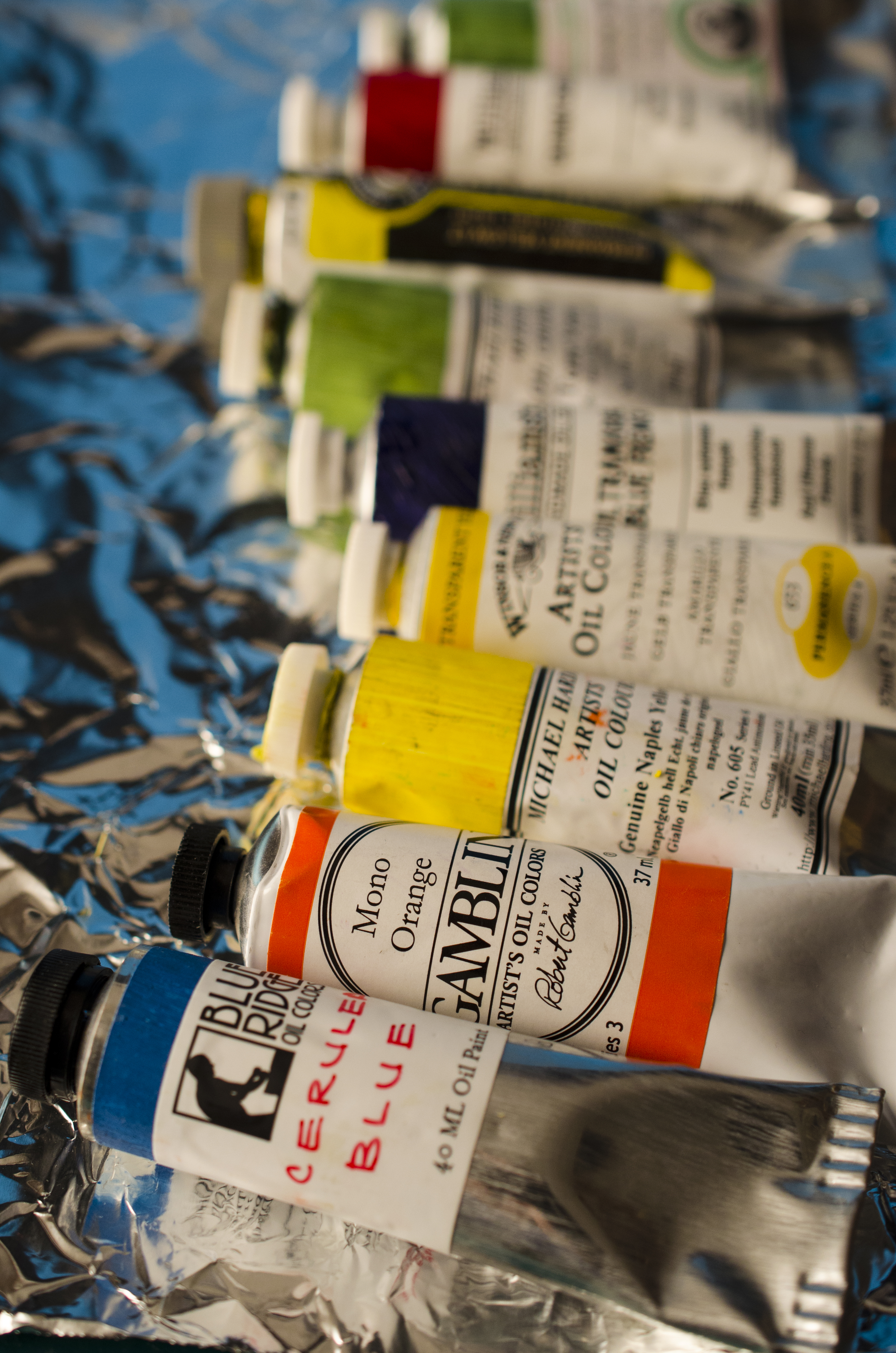
Over the years I’ve collected quite a few tubes of paint from several different manufacturers. I haven’t tried them all, just those that I thought would work with my style of painting. I am not paid by any of these paint makers and have no stock in any of their products. This is just my opinion as an artist. If you are less-than-expertly knowledgeable about how oil paints are made and what they consist of I would suggest that you start by looking at Tony Johansen’s webiste: www.paintmaking.com

First, I’ll list the attributes that I look for in a good oil paint:

Oil used: There are only two oils that I would consider using as the base for the creation of a durable painting: Linseed oil and Walnut oil. Linseed oil is the industry standard and for good reason. It creates the strongest film and drys relatively fast when compared to other drying oils. Walnut oil is a good alternative to linseed oil. It does not form quite as strong of a film as linseed, however it will yellow less over time and gives paint a juicy, brushable quality. Walnut oil, although slower drying than linseed, is still faster than other oils.  Ideally the best paint would be made from a mix of the two in an attempt to get the best of both and reduce each others negative qualities. Some manufacturers use poppy and safflower oils in their paints, particularily in the lighter colours and whites. They do this because poppy and safflower oils yellow less than linseed oil in the short term. However they are much slower drying, and do not form as strong of a film and so I don’t typically use paints made with these oils except in the final layers with the addition of some sort of alkyd medium to improve strength.  I should note here that eventually all oil paint films are going to crack, it’s just a matter of when.

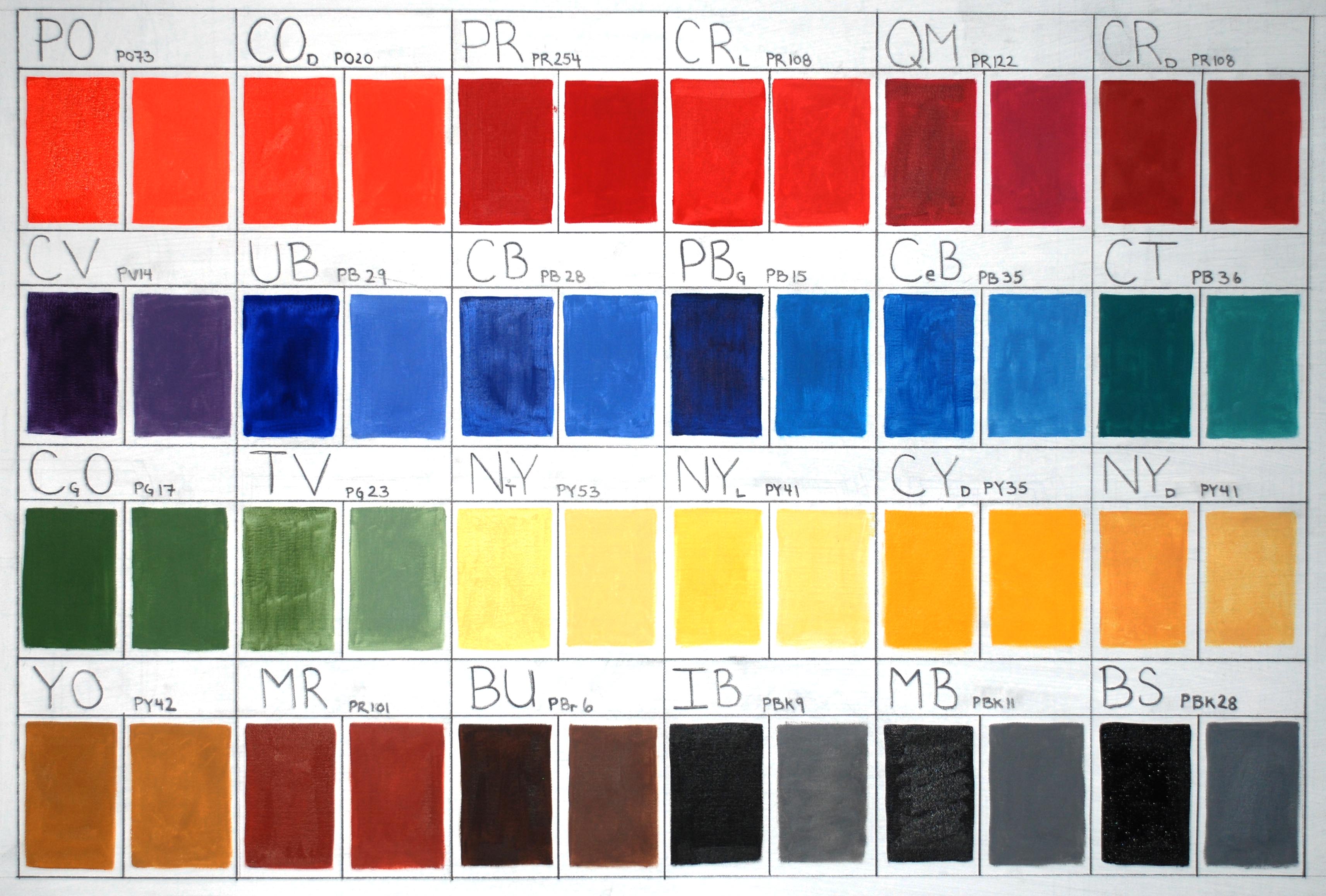
Pigment info: Most professional quality paint manufacturers are good about listing the pigments in the tube. They do this either on the tube itself which is ideal, or on their webpage.  If a manufacturer doesn’t state the pigments used in the paint anywhere then beware! Each pigment has it’s own special characteristics that include drying time, transparency, tinting strength, and hue bias. Knowing the properties allows you to come to informed decisions about the pigments that make up your palette. Some pigments cost more than others, so it is good to know what you are paying for. Taking a gamble on a paint manufacturer that doesn’t list pigments is likely to end in disappointment. For detailed information on specific pigments beyond what is listed on paintmaking.com there are a couple of terrific sites:

www.artiscreation.com

www.handprint.com

Brushability: In what I consider the ideal paint the mixture that comes out of a tube should be soft and workable. Not soupy and runny, and not stiff and dry. Different artists will have a preference for different qualities in this regard and most of that is determined by how thickly you like to apply paint to the canvas.

Transparency: I am not talking about the characteristics of the pigments here, I am talking about the information given out by the manufacturer and how open they are to honest discussion should you have questions. Although there are standards put in place like ASTM D4302  these are entirely voluntary and there is no enforcement of these standards. This means that artists are left to try and figure out whose information and product they trust the most. First off, people would not be selling paint if they didn’t want to make money at it. That should be a given so there should always be some skepticism when dealing with manufacturer statements. You need to be wary of the marketing romance and stick to the facts and scientific evidence. So where do you start here? Well, I look for the company to be led by an artist. If they don’t have any experience painting there is no way they will be able to put the kind of passion and time into the creation of a paint that is required to make something a real artist will love.

Lightfastness: Almost all paint manufacturers still produce Alizarin Crimson (PR83:1). This is because there is still a high demand from artists in general. If you look at any “how-to-paint” book they will most likely recommend Alizarin Crimson for a basic palette. Because of this I can forgive novice painters for buying it and manufacturers for making it. It is indeed a beautiful and useful colour right out of the tube. However, it is what is called a “fugitive” colour in terms of how it stands up to the test of time with regards to it’s colour strength. There are many other pigments that can easily fill the role of Alizarin Crimson and I will talk about those in an upcoming post on what pigments should be on your palette. So, as I said I can forgive manufacturers for still producing Alizarin Crimson. What I can’t forgive however, is when they produce a line of paints full of pigments with poor lightfastness ratings. If they have lots of paints with an ASTM lightfastness rating of 2 or worse that should be a sure sign that the company isn’t overly concerned about the longevity of your work. This can also be said about a company that puts out the majority of it’s colours as mixes of 2 or more pigments. Although some mixes can be really convenient and useful, having an entire line of mixes smells of marketing B.S. more than it smells of linseed oil.

Price: You are going to pay more for a quality paint than for a student grade paint. More pigment in a tube costs more money to make than less pigment. That is certain. However, beyond a certain point you will be paying only for the name and for the marketing romance. This can be seen in many industries, but is probably most obvious in the clothing and accessory world. Many people will pay more money for the same product if it has a certain brand stamped on it. Watch for this because it exists in the world of paints as well. Extremely good paint can be found for a decent price.

Tube quality: I hate it when caps split or tubes break open and paint oozes all over my other tubes. This can be messy and costly and so I prefer to buy paint that comes in decent packages.

The following list is what I consider great paint. I won’t include certain lines that make the tops on many peoples lists because they don’t meet the criteria above (Blockx for example uses poppy oil and so I’ve never used it cause it would dry way too slow for me)

Blue Ridge Artist Colors: In my opinion this is tops. Made in North Carolina by a guy named Eric Silver, Blue Ridge paint meets almost every aspect of what I consider a terrific paint. Eric uses a blend of linseed and walnut oil to mix almost all of his colours (except for his whites which are walnut/safflower). They are blended to a smooth, brushable consistency. Pigment and paint information is readily available on the website. The vast majority of colours that Eric has chosen for his line are lightfastness I. The tubes he uses have not given me any trouble what-so-ever. I really enjoy the wider mouth on them as well. You can’t buy these paints in store, only online through their website. This is not really that inconvenient however as the service is extremely fast and Eric takes such good care at packaging the paint that it has arrived in perfect condition. In fact the tubes I have received were each individually wrapped in bubble wrap and placed in a box just big enough to keep them snug so they didn’t rattle against each other in transit. I am a paint geek. I love every little nuance about paint and using quality materials really affects how I feel about creating. So when paint shows up in pristine condition along with a colour chart and a little thank you note like it does from Blue Ridge I just know that he “gets it”. I’ve ordered a few times now and each time my order was acknowledged, filled and shipped within two days. I have to pay for international shipping as I am Canadian but the quality and price of the paints is more than reasonable enough to make it worth it. The colours are very highly pigmented and the pigments chosen are very beautiful. The majority of my palette is made up of Blue Ridge oil paint. There is a great video of Eric making paint in his workshop that can be viewed here.

Williamsburg Handmade Oil Paint: Williamsburg is a great brand of oil paint. They are a pricier paint which is a detractor, though I don’t think they are necessarily excessively expensive (unlike Old Holland and Vasari). They do have a great selection of earth colours if you are an earth colour junkie and a couple of different Terre Vertes (PG23) which happens to be my favourite oil colour. One thing that used to bother me, that they have recently addressed, has to do with Zinc White. They used to use Zinc in a lot of their mixtures but recently removed it from their lineup. A very smart move in my opinion and that goes a long way to showing me that they are really trying to make a quality product for artists to use.  They are also concerned with lightfastness ratings and have made changes in the past to address any issues they have found.  Overall I rate Williamsburg as an excellent paint, only falling to #2 on my list due to the price point.

Gamblin: Gamblin is a solid brand. I have written to them before and they were very quick to respond and answered my questions clearly and fully. Gamblin paint is widely available and this makes it a great choice for those looking for ease of purchase or hunting for the best price. Gamblin paints are slightly softer than Blue Ridge.  This could be a big problem however if you want to create thick sticky impasto passages. Of all the paint brands I’ve tried I would say on the whole Gamblin has chosen the most beautiful pigments out there. For this reason I buy Gamblin paints for many of my transparent colours. I have never had any issues with Gamblin tubes. If you were only going to use a single brand of paint to fill out your entire palette then in my opinion the Gamblin lineup has a few flaws. The use of Napthol Reds instead of the more lightfast Pyrrol reds leaves a gap in the spectrum for me and the same with the use of Hansa yellows instead of the superior Benzimidazalone yellows. Overall though I think Gamblin paint is a great brand which is good enough for professional use but affordable enough for student use. Robert Gamblin’s vision for paintmaking can be seen in this video.

Rembrandt Oil Colours: Rembrandt is a good brand of paint overall. Their paints are all have excellent lightfastness. The paint is very soft and brushable right out of the tube. If you love natural earth colours then this is not the brand for you. Their earth colours are actually made up of mixes of synthetic iron oxide pigments and ivory black. My guess for doing this is that they are concerned about mining practices or a tendency for umbers to darken over time but I haven’t actually seen this written anywhere. The biggest negative about these paints is the tubes. They seem to be much too thin and I have several that have burst open on me. You can usually get a good deal at dickblick.com  for these paints and so I would highly recommend them to budget concious artists and students. If you are looking for a good selection of colours around the colour wheel and yellows and reds in transparent versions Rembrandt has you covered.

Winsor & Newton Artist Oil Colors: Winsor Newton is a good brand. You can find these paints pretty much anywhere. If there is only one brand of artist oil paint in an art store you can bet it is probably Winsor Newton. They have a good range of colours, are nice to work with out of the tube, and are generally very nice hues. The only negative for me about Winsor Newton is that the company is too big. The paint is made on a production line and machines do much of the work. Although this gives them lots of opportunity for reproducible quality control it also puts a distance between the maker and the product. I just don’t feel as though as much love and thought has gone into this product. I’m going to admit that this seems like a silly thing to say, but it does affect how I feel about working with the paint. Rationally speaking I think the paint is fine and so if this kind of touchy feely thing doesn’t bother you I think you will find that this paint makes for a solid choice you could use with confidence.

Michael Harding Handmade Artist Oil Paint: In the recent past Michael Harding has had an issue with the caps splitting on their tubes, but they will send you replacement caps should you require them. There are a few paints that I love from Michael Harding. Their Terra Verte is the most beautful of the ones I’ve tried and is my staple transparent earth green paint. Harding’s Permanent Orange (PO73) is a lovely brilliant colour that is very strong and very useful. As well, they make a Lead White/Titanium White blend ground in linseed oil which is great. Michael Harding makes a few unique colours that you can’t find anywhere else. Their Genuine Naples Yellow Light is a fast drying light primary yellow I use which is worth the price in my opinion. It is a rarer pigment and also most yellow pigments are very slow drying. I haven’t had a chance to try their Genuine Vermillion or Genuine Lapis Lazuli but from the colour swatches on their website I would say both are easily mixed with much less expensive colours and are not special enough to justify spending $100 on a 40ml tube of paint. I am perplexed by some of the choices of pigments in this range of paints as well as the rationale behind chosing them. For instance if you read the description of his Alizarin Crimson he talks about uptight Americans poo-pooing the pigment because of it’s lightfastness and how they should relax yet for his Crimson Lake paint (PR149) he says he is looking into a new pigment to replace it due to it’s lightfastness even though it is lightfastness 1 in mass tone and 2 in tints. Overall I pick and choose from this line of paints as he does make a few good ones.

Old Holland: There is only one colour from Old Holland that I think is better than other brands and that is their Manganese Blue (PB33). This is only because they are one of the only ones to still produce any since the pigment is no longer manufactured. I saw a comment online from someone stating that they had bought a large enough quantity that they should be good for 100 years of production but when I emailed the company months ago asking to verify this I got no reply. The price of the paints is much too high for what you get. Don’t get me wrong, the paint is good, and if you like a really really stiff paint then you will love the texture, but in my opinion they are not worth the price you have to pay for them. If you want to try them out start out with a few of the A series colours to get an idea as they are reasonably priced. I have a couple of the cadmiums and cobalts and I have to say that they are no better than Blue Ridge paints which happen to be half the price. Another thing I don’t like about Old Holland paints is that they give a blanket lightfastness to their line (they say 7 or 8 on a 1-8 scale where 8 is best) that does not fall in line with ASTM testing (or any other manufacturers testing for that matter) of the pigments. They also make way too many mixtures and useless colours. It seems to me they are just catering to those with a fetish for collecting every tube of paint they make. If you like a really stiff paint then these are for you but overall you can get more beautiful hues, the same amount of pigment, and more honesty for less money elsewhere.

Vasari Classic Artist Oil Colors:  I haven’t used any of Vasari’s colours.  This is because I find their prices are astronomical, and their information and customer service is severely lacking.   On their website you will notice that as you look at each colour you will only find the pigment information for a few.  This information it appears is only for the single pigment paints.  I wrote them an email to ask if I could see a chart or get information on their pigments in all of their paints.  They didn’t respond to that email, but I know they got it because they added me to their distribution list for their mass emails.  I sent another email about 3 months after the first one thinking maybe they just forgot to respond but yet again no response. I know that David Kassan swears by these paints, but I just can’t help but think that no matter how good they are these must be the most over priced paints out there. For instance you will pay $68.25 US dollars for a 40ml tube of their Cerulean Blue.  The kicker is that it isn’t even a PB35, they use the cheaper PB36 and still charge the big bucks for it.  A 40ml tube of their ivory black will run you almost 21 dollars.  Insanity. Vasari is the Gucci of the paint world.

The Definition of Art

sssssss
Updated 27 Jan 2017

People have been making art for at least 30,000 years. Despite that, a clear, concise, precise definition of art has not yet been agreed upon. As an artist, lacking a definition bothered me. How could I make art if I couldn’t even say with certainty what it was? I think we all have some sort of intuitive sense about what makes something art. For most practical purposes that is enough and people carry on producing work. There certainly doesn’t seem to be an absolute need for a clear definition. But to satisfy my intellectual curiosity on the subject I looked at the history of art and tried to condense it down into as few sentences as possible. The following is my definition of art:


The term art can be applied to objects or performances which have been created and/or manipulated such that the only sensible use of the object or performance (taking into consideration intention and context) is to provide a unique symbolic representation of an object(s), idea(s), emotion(s) or a combination thereof.


Before going any further I think it is worth noting that by drawing a line and defining art I am not trying to make a judgement call on things which are not art. Art is no better or worse than craft for instance, just different, and as such I believe it needs a different definition.


According to my definition the following fields can be included as disciplines of art: painting, sculpture, drawing, printmaking, photography/videography, music, theatre, dance,  and performance art. Those fields which are frequently confused with art but do not qualify by my definition are: architecture and craft. Both can be easily distinguished from art in the way that the objects created have a practical purpose other than just symbolic representation.


It is imperative when looking at this definition to define what a “sensible” use of an object or performance is. While at first glance this word seems inadequate due to its subjective nature, I believe that on examination it is possible to determine sensibility.  The idea that art has no other sensible use other than symbolic representation is important is because it sets art objects apart from all the other everyday objects around us. Art is something special.  It’s lack of physical utility is a testament to the fact that we have come so far as a culture that we can afford to invest the time, money, and thought into something with absolutely no material use.

david_by_michelangelo_jbu0001

Let’s look at an example to see how this idea works.   Take Michelangelo’s David for instance.  You could certainly use it for something other than an art object.  For instance you could use it as a battering ram to knock down a door, or as a giant paperweight to stop something from flapping in the wind.  However, these don’t seem sensible given the amount of time, thought and effort that was put into the object by its maker, not to mention the sheer value of the raw materials. It is important to note that the artist’s intention is an important part of how we look at an object.


Michelangelo’s work is easy to categorize as art compared to a much different work put forth by Marcel Duchamp; “In Advance of the Broken Arm”. For this piece, Duchamp went to a hardware store, purchased a shovel, put his name on it and hung it in a gallery.  Much like his work, “Fountain” Duchamp was trying to use the shovel as a symbolic representation for an idea.  However, the most sensible thing to use a snow shovel for is to shovel snow.  And thus it seems that by my definition this work does not count as art. However, we need to consider the context in which the work has been presented. In a gallery setting the shovel no longer has the same usefulness. This contrasts with other shovels hung in garages and garden sheds that do not have the same context. It should be noted that other readymades he created like “Bicycle Wheel” are much more easily described as art under this definition as their specific assembly negates their usefulness. “Fountain” is the same in this regard. Its orientation and placement in an open public space that is not a bathroom makes it unusable as a functional urinal.


When we give a definition to something it not only provides a framework for what constitutes that thing, but many times it also allows us to determine its quality. It seems however that this is not the case with art. We might try to say that one work of art is better than another if it is better at symbolically representing an object(s), idea(s) emotion(s) or combination thereof.  However, when we study the history of art this does not always hold true. Some of the most popular and beloved works of art are held in high regard specifically because of their ambiguity (Mona Lisa’s smile for instance).  In fact many times it seems that the more interpretations you can extract from an artwork (even if they are contradictory) the more popular it can become. I believe that the ideas of what is good and bad are much too subjective and personal to have any real relevance when it comes to art.  The determination of whether something is good or bad is subjective, circumstantial and subject to change.  As such each person must create their own criteria to determine a work’s worth. Museums, art critics and others